SNMP Trap Data Visualizer
This is the newest feature of NSTI 3.0 and it will be getting updated more in the future. For now it is a simple way to visualize the overall trap data you have in your table to get a better overall view of what your traps are doing. This combined with filters and the search function will make reading and troubleshooting trap data much easier.
Here is an example of the visualizer showing a Graph of Severity:
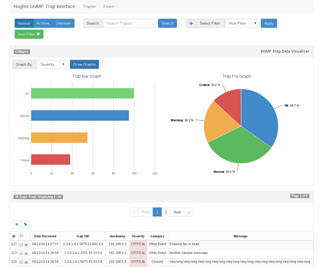
Visualizer will access all of the traps in your database and draw a bar and pie graph based on your Graph By selection. Filters are not applied to the Trap Data Visualizer.
The Future of the Visualizer
Below is a list of our future plans for the Visualizer:
- Adding the ability to choose the type of graph you want to display (line, bar, pie, scatter)
- Choose the type of trap data to compare against a certain time period or date range
- The ability to limit the number of traps displayed by ID range, number, date, status, etc.
Any suggestions and ideas for future development of the Visualizer would be very much appreciated. You can get them to us through github or email.
Note